If you shop on Amazon or sell products there, knowing how prices have changed in the past can save you money-and time. Keepa is the go-to tool that lets you track those changes with colorful, detailed graphs. At first, though, those busy lines can seem overwhelming.
In this post, well break down every part of a Keepa chart so you read it with ease. Well show you how to spot upward trends, find hidden bargains, and use the same data whether you buy for yourself or manage an Amazon store. Before you finish, youll feel sure about every squiggly line.
Understanding the Keepa Graph Basics
The Graph Layout
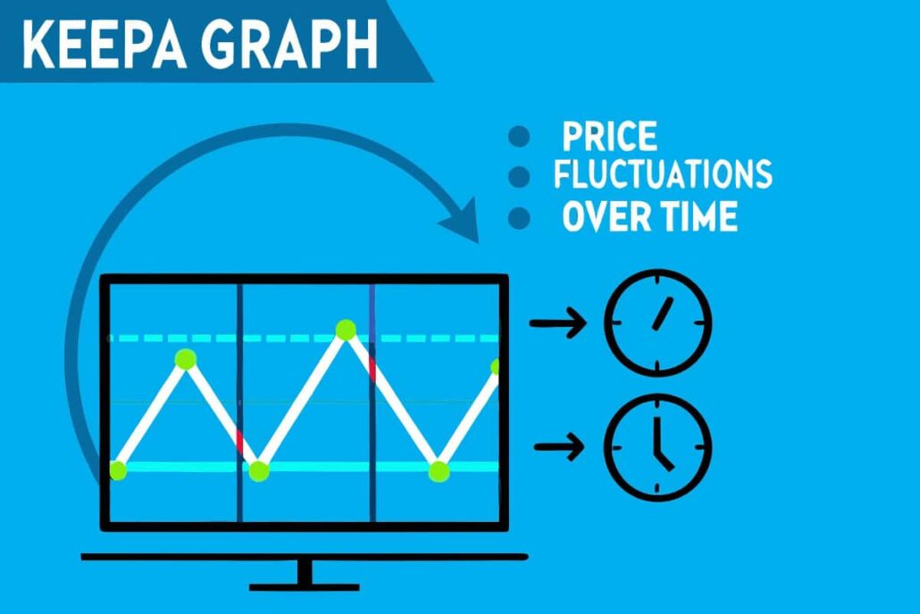
Each Keepa graph stacks price records over a timeline, almost like a digital notebook page. Across the bottom, dates stretch from past to present; up the side, you see how much the item costs. Because different prices-regular, sale, Amazon, third-party-sit on the same sheet, it can look like a color explosion at first.
Keepa decides the initial time range on its own. Older products may reveal three years of ups and downs, while recent items show only a handful of months. Luckily, you can grab the slider at the top and zoom in or out whenever you want.
Essential Color Coding
Keepa uses easy-to-spot colors to tell different price types apart:
- Orange Line: Shows the price when Amazon itself is selling the item. If you see orange, Amazon is the seller and not a third-party merchant.
- Blue Line: Displays new-item prices from other sellers. This line points to the lowest price available for a brand-new product outside of Amazon.
- Gray Line: Tracks the prices for used items. Watch this line to see the cheapest pre-owned version of the product.
- Green Line: Represents the sales rank. Higher ranks mean the product is moving fast compared to similar items.
- Red Line: Covers warehouse deals. These are discounted goods with damaged packaging or small defects.
- Pink Line: Breaks down referral and FBA fees for sellers. This line lets sellers estimate profit after all costs.
Reading Price Movements and Trends
Identifying Price Patterns
Getting good at reading Keepa graphs starts with spotting common patterns. Watch for seasonal ups-and-downs, big sales events, and times when stock runs out.
Seasonal items usually follow an easy rhythm. Holiday decorations cost more right before the holidays and drop afterward. Summer gear is cheaper in winter, so shoppers stock up early. Electronics often slide in price just before new models hit shelves.
What Price-Tracking Graphs Can Teach You
Price graphs sometimes show big blank spaces. Those spaces are stock-outs, moments when shelves stood empty and prices zoomed up. Once fresh units arrived, prices usually eased back down and the gaps filled in.
Spotting Good Deals
The clearest bargain appears as a sharp tumble on the line that sits way below the long-term average. That steep dip could be a quick lightning deal, a clearance blowout, or simply a seller mis-entering a number.
Steady prices show steady demand. If a product costs about the same week after week, it probably stays in stock. Prices that whip around signal shortages, new competition, or sellers just fishing for buyers.
The all-time low on any chart acts as your gold standard. If todays tag nears that level, it usually makes sense to hit Add to Cart instead of waiting.
A sudden jump in a product’s sales rank usually means a brief promotion or it went viral online. These short-lived booms often come just before sellers raise the price because demand suddenly outstrips the available stock.
Understanding Availability Gaps
When you look at a pricing chart, empty spaces or gaps between the price lines tell a story about how many units are actually on hand. A narrow gap likely points to a quick stock-out, while a wide, empty stretch can suggest the item was discontinued or the supply chain is holding up shipments.
If multiple types of sellers vanish from the listing at the same time, that usually points to a broader inventory problem across the marketplace. Once stock finally rolls back in, the sellers still active are usually the first to push prices higher.
So keep an eye on who still has products during a shortage. Amazon itself usually keeps a steadier supply, while independent third-party merchants can cycle in and out of stock far more often.
Tracking Multiple Timeframes
With Keepa you can pull up charts for almost any period you want, from one day to several years at a stretch. Each window offers a fresh perspective:
- Short-term views (1-7 days) spotlight daily wiggles and flash deals. This is perfect when you need to buy right now.
- Medium-term views (1-6 months) show the seasonal ups and downs or normal sales months. Knowing this helps you time your order with a predictable dip.
- Long-term views (1+ years) reveal the big-picture trend so you can tell if a products value is generally climbing or falling over many seasons.
Practical Uses for Different Keepa Users
For Amazon Sellers
Many Amazon sellers turn to Keepa graphs when they need quick, trustworthy data for sourcing and pricing. By looking at how rivals change their prices over time, sellers can spot the sweet spot for their own listings. Search for offers with steady demand, shown by an even sales rank, and compare them against healthy profit margins.
Keepa also lets sellers watch their own product history, revealing how well an item sits in the market. If competitors keep undercutting a price, the seller might tweak the offer, lower costs, or highlight a unique feature.
Seasonal trends show up clearly in old price charts. Knowing that Halloween costumes or winter boots spike every November tells sellers to restock early and avoid last-minute shortages.
For Smart Shoppers
Casual shoppers, on the other hand, grab Keepa to find the best moment to hit buy. They can set free price alerts on favorite gadgets, toys, or household items and relax until Keepa nudges them with good news.
People should also peek at the price history next to the current tag. If the graph shows the number is way above the average line, it might be smarter to wait or skip the purchase altogether.
For wish list items that rarely change, tracking the history reveals clear buying windows. many bigger brands run predictable sales every Black Friday, Prime Day, or back-to-school week, so shoppers who plan ahead save the most.
For Market Researchers
Market researchers lean on Keepa data to spot trends and size up the competition. You can follow how a fresh product launch nudges prices on similar items or see how supply-chain hiccups move prices across whole categories.
Examining price swings side-by-side with shifts in sales rank lets you study price elasticity. That link shines a light on shopper habits and the bigger pulse of the market.
Common Mistakes to Avoid
Misinterpreting Price Spikes
A sudden jump in price does not always mean the market is changing for good. Spikes can stem from super-low stock, a glitch, or a retailer tweaking its algorithm. Pause and check if the move holds over several days before swinging your strategy.
Ignoring Sales Rank Context
Looking at price alone tells only part of the story. An item with a rock-bottom price and a grim sales rank may suffer from quality issues, weak demand, or just bad reviews. Always pair price data with sales rank to get a full picture.
Focusing Only on Lowest Prices
The very lowest price Keepa ever recorded may have come from a rare clearance event or a listing error. Chasing that one number blindfolds you to typical price patterns. When planning purchases or sourcing, hone in on the normal price range instead of the extremes.
Setting Up Effective Price Tracking
Creating Price Alerts
Keepas alert tool pops up a message when an items price hits your sweet spot. To set a useful target, review the history chart first and skip the day-dream discounts that are unlikely.
Set Alerts for Every Seller Option
If you’re okay with buying from different sellers, set alerts for a few price types. That way, you can grab the lowest price before it vanishes. Some shoppers even choose a slightly higher Amazon price just for quicker shipping and easier returns.
Use Browser Extensions
The Keepa browser add-on shows a product’s price history right on its Amazon page. Because the chart lives where you’re already shopping, you never have to jump to another site. One quick glance tells you if the current price is a deal or not.
Use Browser Extensions on Mobile
The same extension works on many phones, so price checks travel with you. Whether you’re waiting in line or sitting on the couch, up-to-date data is always a tap away.
Maximize Your Keepa Graph Analysis
Learning to read the Keepa chart takes a little time, so start slow. Pick items you already know, track their highs and lows, and notice seasonal spikes. With practice, you’ll spot the profitable flips that beginners often miss.
Keep Past Data in Mind
Stay aware that Keepa shows what has happened, not what definitely will happen next week. Use the past as a guide, but keep an eye on trends that could twist the market overnight.
Mastering these skills stretches your dollars, whether you’re building a store or just trying to save. Spend a few minutes today, and tomorrow’s smarter buys will show you the real value of that effort.
You can start using these tips this afternoon by pulling up a couple of products you care about. The more you play with the charts, the easier it gets. Before long, youll read Keepa graphs the way a pro does, spotting hidden deals and trusting the numbers to guide every choice.
Learn to read Keepa graphs like a pro. Master Amazon price tracking, spot deals, and make smart buying decisions with this comprehensive guide.
People who hunt for Amazon bargains know that prices climb and drop all the time, sometimes in a single day. That makes it hard to tell if a sale is truly special or just marketing smoke. A Keepa graph steps in as your crystal ball, showing you the price history, stock levels, and even when lightning deals flash on and off. With a glance, you can see whether todays price is a steal or whether waiting two weeks would save you a few bucks.
Related posts:
 Keepa Group Buy- Amazon price history charts Tool
 How can Keepa help me identify the best time to buy or sell on Amazon?
 11 Amazon Product Research Tactics That Actually Work in 2026
 How to Find Profitable Products for Amazon in 2026
 What is Online Arbitrage? A Beginner’s Guide to Profitable Reselling
 How to Do Amazon Product Research: A Complete Guide
 Why Pain-Driven Product Research Creates Breakthrough Solutions
 Amazon Glossary for Sellers: 75+ Essential Terms You Need to Know